Choosing the right colour for your kitchen might seem like a small decision, but it can make a big difference. The colour you pick doesn’t just affect how your kitchen looks it also influences how the space feels. A well-chosen colour can make a small kitchen feel bigger, a dark kitchen feel brighter, and a plain kitchen feel more stylish and welcoming.
The kitchen is often the heart of the home, where meals are made, conversations happen, and memories are created. That’s why the colours you use should reflect not only your personal taste but also the mood you want to create in that space.
In this blog, we’ll explore how to choose the best colour for your kitchen. We’ll look at what to consider before picking a colour, popular options and their meanings, smart colour combinations, and common mistakes to avoid. Whether you’re painting walls or choosing cabinet shades, this guide will help you make the right choice — simply and confidently.
Things to Consider Before Choosing a Kitchen Colour
Before you grab a paintbrush or pick out new cabinets, it’s important to think about a few key things. These will help you choose a colour that not only looks great but also works well in your space.
1. Size of Your Kitchen
If your kitchen is small, lighter colours like white, soft grey, or pale pastels can make it feel bigger and more open. Darker colours can make a small space feel tight or crowded. In larger kitchens, you have more freedom to play with bold or deep colours, especially if the space is open and airy.
2. Amount of Natural Light
Does your kitchen get a lot of sunlight or is it mostly lit by bulbs? Natural light brings out the true tone of colours, so if your kitchen has big windows, you might have more colour options. In darker kitchens, it’s usually better to stick with lighter, brighter shades that reflect light and make the space feel more inviting.
3. Style of Your Kitchen
Is your kitchen modern and sleek, or more classic and cozy? For modern kitchens, neutral colours like grey, white, or black work well. For a farmhouse or rustic look, soft greens, warm creams, or natural wood tones are a good fit. Your kitchen’s design should guide your colour choices.
4. Your Personal Taste and Lifestyle
Your kitchen should reflect your personality. Do you love bold colours or prefer calm, neutral tones? Think about what makes you feel comfortable and happy because you’ll be spending a lot of time in this space. If you’re someone who enjoys peaceful mornings with coffee, a soft and calming colour palette might be best. If you like energy and creativity, brighter shades could be a better match.
5. How Often You Cook or Entertain
If your kitchen is a busy spot where you cook daily or host friends and family often, go for colours that feel warm and welcoming. You might also want to pick colours that are easy to maintain and don’t show stains easily. On the other hand, if the kitchen is more of a visual feature in your home, style and boldness might take priority.
Popular Kitchen Colours and What They Mean
Choosing a kitchen colour isn’t just about what looks good it’s also about how a colour makes you feel. Each colour gives off a different vibe and can change the whole mood of your space. Let’s take a look at some popular kitchen colours and what they bring to the table.
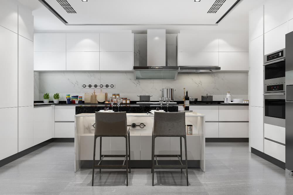
1. White
White is a classic choice that never goes out of style. It makes a kitchen feel clean, bright, and open. It’s especially great for small spaces because it reflects light and creates the illusion of more room. White also pairs beautifully with almost any other colour, making it super easy to match with countertops, backsplashes, or decor.
2. Grey
Grey is a modern, neutral colour that works well in many kitchen styles. It gives a clean and balanced look without feeling too cold or too bold. Lighter greys are great for a soft, calming feel, while darker greys can add depth. Grey also pairs well with other colours like navy, mustard, or natural wood tones.
3. Blue
Blue brings a calm, cool feeling into the kitchen. Soft, light blues are perfect for a coastal or cottage-style kitchen, while deeper blues like navy can add a rich, modern touch. Blue works especially well on lower cabinets or islands, paired with white or light countertops.
4. Green
Green has a natural, earthy vibe that’s become very popular in kitchens. From soft sage to deep forest green, it brings a sense of freshness and calm. Green works great for cabinets, feature walls, or even tiles. It pairs nicely with wooden accents, gold hardware, or creamy whites.
5. Yellow
Yellow is bright, cheerful, and full of energy. It brings warmth into the kitchen and can make the space feel sunny even on gloomy days. It’s a great choice for adding a splash of colour without going too bold. Use it on walls, in decor, or as a fun backsplash accent.
6. Black or Dark Colours
Black, charcoal, and other deep colours are bold and dramatic. They create a high-end, stylish look especially in modern or industrial kitchens. Dark colours are best used in larger kitchens with plenty of natural light, as they can make small spaces feel even smaller. Paired with the right lighting and finishes, they can look incredibly chic and sophisticated.
Best Colour Combinations for Kitchens
Sometimes, the magic happens not in a single colour but in how two or more colours work together. The right combination can add depth, personality, and balance to your kitchen. Here are some popular and timeless kitchen colour combos that always look good:
1. White and Wood
This is a warm and inviting combo. Crisp white walls or cabinets paired with natural wooden elements (like shelves, countertops, or floors) create a fresh yet cozy feel. It’s perfect for farmhouse, Scandinavian, or minimalist kitchens.
2. Grey and Navy
For a sleek, modern look, grey and navy work really well together. Grey brings softness, while navy adds richness and depth. Try grey cabinets with a navy kitchen island or mix navy lower cabinets with light grey upper ones.
3. Green and Gold Accents
This combo feels elegant and earthy at the same time. Soft green cabinets with gold hardware or light fixtures can add a touch of luxury without being flashy. It’s great for creating a nature-inspired, stylish space.
4. Soft Pastels with White
Pastels like mint, blush, or baby blue paired with white give your kitchen a gentle, airy feel. This combination is perfect if you want something light, playful, and full of charm. It works well in smaller kitchens or homes with a vintage or cottage vibe.
5. Black and Natural Wood
This is a bold and beautiful choice. Black adds drama, while wood tones warm it up and keep it grounded. Think black cabinets with wooden countertops or wooden open shelves against a dark backdrop. It’s ideal for modern, industrial, or rustic kitchen styles.
Tips for Choosing the Right Colour
Picking a kitchen colour is exciting, but it’s also a decision that sticks around for a while. Here are some helpful tips to make sure you choose a colour you’ll love not just now, but for years to come.
1. Test Paint Samples Before Deciding
Colours can look very different depending on lighting and surroundings. Before committing, paint a few sample patches on your kitchen walls and observe them at different times of the day. Natural light, shadows, and artificial lighting can all affect how a colour actually looks in your space.
2. Think Long-Term
It’s easy to fall for trendy colours, but ask yourself: Will I still love this in five years? Choosing a timeless colour or one that suits your personal taste (rather than what’s currently popular) can help avoid regrets down the road.
3. Don’t Forget About the Ceiling and Floor
When choosing a colour, consider how it will look alongside your ceiling and flooring. These surfaces take up a lot of visual space and can either clash or complement your chosen colour. Neutral floors work with most shades, but patterned or bold flooring might require a more subtle wall or cabinet colour.
4. Match with Your Cabinets and Countertops
Your kitchen colour should harmonize with your existing cabinets, countertops, and backsplash. If you’re not planning to change these elements, make sure your new colour works well with them. Take a sample of your countertop or cabinet finish with you when shopping for paint or tiles — it’ll help you make a smarter match.
Mistakes to Avoid
While choosing a kitchen colour can be fun, there are a few common mistakes that can lead to disappointment. Keep these in mind to make sure your kitchen looks and feels just right.
1. Going Too Bold in a Small or Dark Space
Bold colours like deep blue, black, or dark green can look stunning but they don’t always work in every space. In small or poorly lit kitchens, dark shades can make the room feel cramped or gloomy. If you love bold colours, use them as accents or on lower cabinets, and keep the rest of the space light and airy.
2. Ignoring Lighting Conditions
Lighting plays a huge role in how colours appear. A colour that looks beautiful in a well-lit showroom might seem dull or too dark in your kitchen. Always think about how much natural and artificial light your space gets, and test colours accordingly. A colour that works in a bright, sun-filled kitchen might not work as well in a shaded or north-facing room.
3. Following Trends Blindly
Trends come and go, but your kitchen is something you’ll live with every day. Just because a certain colour is “in” right now doesn’t mean it’s right for your space or your taste. Focus on what feels good to you and fits your kitchen’s size, style, and lighting not just what’s popular on social media or in magazines.
So, What’s the Best Colour?
When it comes to kitchen colours, there’s no one-size-fits-all answer. The best colour for your kitchen depends on your space, your style, and how you want the room to feel.
Some people love the freshness of white, while others prefer the bold look of navy or the warmth of natural tones. What matters most is choosing a colour that fits your kitchen’s size, lighting, and layout and one that makes you feel good every time you walk in.
Remember, a great kitchen colour isn’t just about looks. It should be practical too easy to clean, pleasant to be around, and something you won’t get tired of quickly. When beauty and practicality come together, that’s when you know you’ve picked the right colour.
So take your time, test your options, and choose what feels right for your home. After all, it’s your kitchen it should reflect you.
Ready to Refresh Your Kitchen?
Take a fresh look at your kitchen not just as a place to cook, but as a space full of design potential. Whether you’re dreaming of a calm, cozy vibe or a bold, modern upgrade, the right colour can make all the difference.
Start small: grab a few paint samples, explore colour visualizer tools, and see what inspires you.
Need help bringing your vision to life? At SmartScale House Design, we specialize in creating stylish, functional kitchen spaces that feel like home. From layout planning to colour consultation, we’re here to guide you every step of the way.
Let’s design a kitchen you’ll love for years to come. Contact us today!