Your living room is more than just four walls and furniture it’s the vibrant hub where your family creates memories, where guests feel your home’s warmth, and where life’s most precious moments unfold. Have you ever walked into a room and immediately felt uplifted, calm, or energized? That’s not coincidence; it’s the power of color working on a subtle, energetic level.
Choosing the best colour for living room as per Vastu can transform not just your décor, but the entire energy of your home. With over 5,000 years of wisdom, Vastu Shastra offers proven guidelines for selecting colors that enhance prosperity, health, and happiness.
According to Vastu Shastra, the 5,000-year-old Indian science of architecture and spatial energy, the colors you choose for your living room can profoundly influence your family’s health, prosperity, relationships, and overall happiness. In this comprehensive guide, you’ll discover the ideal living room colours according to Vastu for every direction, universal Vastu-compliant color schemes, and practical tips for implementation.
Table of Contents
ToggleQuick Answer: Which Colour is Best for Living Room According to Vastu?
The best colour for your living room depends on its direction:
- North-Facing: White, cream, light blue, or silver (attracts wealth and opportunities)
- East-Facing: Light green, aqua, or cream (promotes health and new beginnings)
- South-Facing: Coral, peach, or warm beige (enhances energy with balance)
- West-Facing: White, yellow, or beige (supports relationships and gains)
Universal Best Choices: If you’re unsure of the direction, white, cream, and light yellow are safe, Vastu-compliant colours that work beautifully in any living room.
Why Living Room Colours Matter in Vastu Shastra
Before diving into specific color recommendations, let’s understand why Vastu places such importance on color choice. Vastu Shastra recognizes that every color emits a unique frequency and vibration. These vibrations interact with the five fundamental elements earth, water, fire, air, and space that form the building blocks of our universe.
Colors also resonate with the eight cardinal directions, each governed by different planetary energies and deities. When your living room colors align harmoniously with its directional orientation, you create an environment where positive cosmic energy flows freely, supporting your family’s wellbeing and aspirations.
Think of it this way: just as certain foods nourish your body while others deplete it, certain colors energize your living space while others can drain it of vitality. Choosing the right colors is like giving your home a healthy, balanced diet of positive vibrations.
Direction-Specific Color Recommendations: Finding Your Perfect Palette
The most important factor in selecting Vastu-compliant colors is determining which direction your living room faces. Here’s how to identify your room’s direction: stand in the center of your living room and use a compass to find which direction the main entrance or largest window faces. That’s your room’s orientation.
Best Colours for North-Facing Living Room According to Vastu
Vastu-Recommended Colours: White, cream, light blue, silver, and pale grey
The north-facing living room colour as per Vastu should align with the water element. If your living room faces north, you’re blessed with the direction governed by Lord Kubera, the deity of wealth and prosperity.
Why These Colors Work: White and cream create a sense of spaciousness and reflect light beautifully, symbolizing clarity in financial decisions and open channels for opportunities. Light blue resonates with the water element, promoting a calm, flowing energy that attracts abundance without aggressive pursuit. Silver accents add a touch of sophistication while enhancing the metallic quality that complements water energy.
Practical Application: Paint your main walls in soft white or cream, and introduce light blue through curtains, throw pillows, or an accent wall. Add silver-framed mirrors or metallic decorative pieces to amplify the prosperity energy. Avoid heavy, dark furniture that might block the free flow of opportunity into your life.
Best Colours for East-Facing Living Room as Per Vastu
Vastu-Approved Colours: Light green, aqua, cream, white, and soft wooden tones
For an east-facing living room, Vastu Shastra recommends nature-inspired colors that promote health and vitality. The east is where the sun rises, bringing new energy each day. This direction is ruled by the sun god Surya and represents health, vitality, and fresh starts.
Why These Colors Work: Light green connects you to nature’s healing power and promotes growth in all areas of life—health, relationships, and personal development. It’s particularly beneficial for families with children or anyone recovering from illness. Aqua combines the healing properties of blue with the renewal energy of green, creating perfect harmony for an east-facing space.
Practical Application: Consider a soft sage green or mint for your walls, which creates a refreshing backdrop without overwhelming the senses. Pair this with white trim and natural wooden furniture in light oak or birch. Introduce aqua through artwork, vases, or decorative accents. This combination will make your living room feel like a breath of fresh air, supporting your family’s health and encouraging positive new opportunities.
Ideal Colours for South-Facing Living Room in Vastu
Best Vastu Colours: Coral, terracotta, soft pink, peach, and warm beige
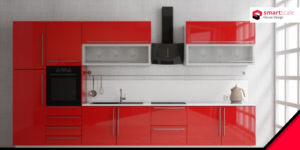
The south-facing living room colour combination requires careful selection. This direction is governed by Mars and the fire element, making it the most energetically intense orientation. While bold reds and oranges are traditionally associated with the south, Vastu experts recommend using them with thoughtful moderation.
Why These Colors Work: Soft coral and peach harness the fire element’s vitality without creating excessive heat or tension. These warmer hues promote courage, determination, and social warmth—perfect for a space where you entertain guests. Terracotta connects to the earth element, grounding the fire energy and preventing it from becoming overwhelming.
Practical Application: Instead of painting all walls in intense red (which can increase arguments and restlessness), opt for warm beige or cream walls with coral or terracotta accents on one feature wall. Use peach and pink in upholstery, curtains, or decorative elements. This approach gives you the south’s beneficial energy without the negative effects of color excess. Balance fire colors with natural materials like clay pots, wooden furniture, and indoor plants to moderate the intensity.
Perfect Colours for West-Facing Living Room According to Vastu
Recommended Vastu Colours: White, yellow, beige, light grey, and metallic accents (copper, bronze, gold)
For west-facing living rooms, Vastu Shastra recommends warm, grounding colors. The west represents gains, achievements, and relationships. It’s associated with Saturn and the earth element, making it responsive to stable, grounding colors with touches of warmth and radiance.
Practical Application: A creamy white or soft beige base provides stability, while accents of warm yellow bring optimism and joy to family gatherings. Metallic touches in copper or bronze add depth and reflect light beautifully during evening hours when the setting sun illuminates your west-facing room.
Why These Colors Work: Yellow is the color of intellect and social connection, making conversations flow more easily and creating a welcoming atmosphere for visitors. Beige and white provide the grounding that west’s earth element requires, while metallics enhance the direction’s association with gains and rewards for hard work.
Universal Vastu Colours for Living Room: Safe Choices for Any Direction
If you’re uncertain about your living room’s exact direction or want Vastu-compliant colors that work universally, these options are beneficial regardless of orientation. These are the safest living room paint colours as per Vastu:
White: The Universal Harmonizer
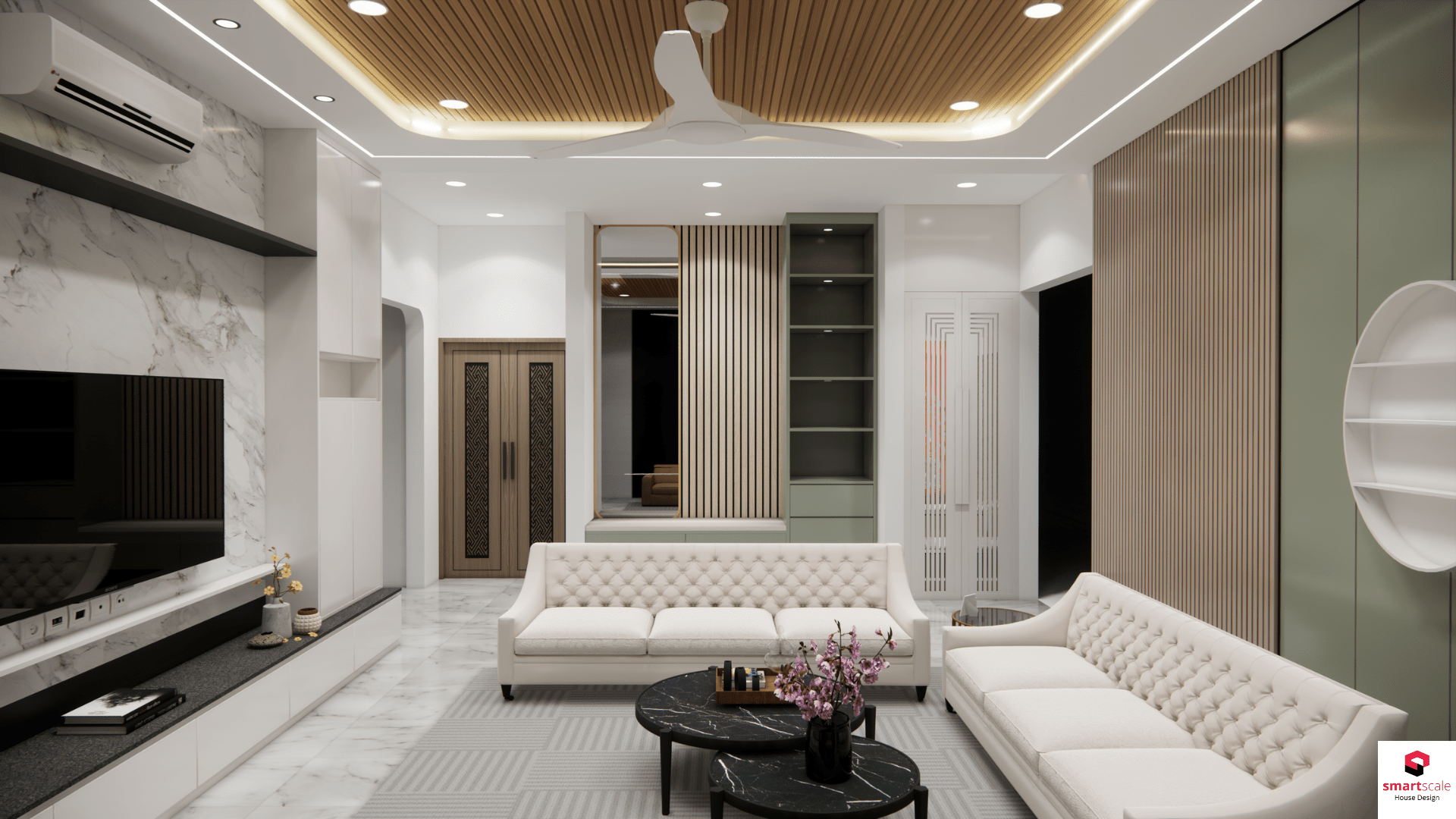
White is Vastu’s most versatile color, representing purity, peace, and infinite possibility. It reflects maximum light, making spaces feel larger and more open. White creates a blank canvas that allows other elements—furniture, artwork, family photos to shine while maintaining a calm, neutral energy base. For small living rooms, white is particularly valuable as it prevents the space from feeling cramped or heavy.
Light Yellow: The Happiness Catalyst
Soft, buttery yellow brings sunshine into your home regardless of external weather. It stimulates the intellect, encourages optimistic thinking, and creates warmth without the aggression of bolder colors. Yellow is especially beneficial in homes where family members struggle with depression or low energy, as it naturally lifts spirits and promotes cheerful conversation.
Cream and Beige: The Stability Providers
These earth-tone neutrals ground your living room in comfort and timeless elegance. They work beautifully with virtually any decor style—from traditional to contemporary—and create a sophisticated backdrop that won’t feel dated as trends change. Cream and beige also have the practical advantage of hiding minor wear and tear better than stark white.
Light Green: Nature’s Healing Touch
Soft, muted greens bring the outdoors inside, creating a restorative environment that reduces stress and promotes emotional balance. Green is the color of the heart chakra in yogic tradition, making it ideal for a space dedicated to family bonding and love. It’s particularly recommended for living rooms in urban apartments where natural views are limited.
Light Blue: The Calmer of Minds
Gentle blues evoke the tranquility of clear skies and calm waters. This color is exceptional for households with high-stress lifestyles, as it naturally lowers blood pressure and reduces anxiety. Light blue encourages clear communication and honest expression—valuable qualities for family discussions and resolving conflicts peacefully.
Colours to Avoid in Living Room According to Vastu Shastra
Understanding which colours to avoid as per Vastu is equally important as knowing which to embrace. According to Vastu principles, certain colors can disrupt energy balance in your living room:
Black and Very Dark Colors: While sophisticated in small doses, predominantly black or very dark brown living rooms absorb light and positive energy, creating a heavy, depressing atmosphere. These colors can lead to lethargy, negative thinking, and blocked opportunities. If you love dark accents, limit them to 10-15% of the room’s color palette.
Excessive Bright Red: While red is auspicious in Vastu for certain purposes, too much bright red in a living room can increase aggression, arguments, and restlessness. Family members may feel constantly on edge, and guests might find the space overwhelming rather than welcoming.
Very Dark or Muddy Shades: Colors that appear dull, muddy, or excessively dark—like olive drab, murky brown, or dusty purple—stagnate energy flow and can create a sense of confusion or stuck emotions within the space.
How to Apply Vastu Colours in Your Living Room: Practical Implementation Tips
1. Start with a Paint Sample: Before committing to a full room, paint large poster-sized samples on different walls and observe them at various times of day. Colors look dramatically different under morning sunlight versus evening artificial light.
2. Use the 60-30-10 Design Rule: Apply your main Vastu color to 60% of the room (walls), a secondary complementary color to 30% (upholstery, curtains), and an accent color to 10% (decorative accessories). This creates visual harmony while maintaining Vastu compliance.
3. Layer with Texture: Vastu-approved colors needn’t be boring. Add visual interest through varied textures—a cream linen sofa, white sheer curtains, beige jute rug—keeping the color palette peaceful while creating depth and sophistication.
4. Balance with the Five Elements: Incorporate all five Vastu elements in your color scheme. Your wall color might represent one element (like blue for water), but balance it with earth-tone furniture, metal accents, wooden pieces, and open space to create complete harmony.
5. Consider Your Family’s Needs: While following Vastu guidelines, also consider your household’s specific requirements. A family with young children might benefit from more energizing yellows and greens, while a couple seeking tranquility might prefer calming blues and whites.
6. Refresh Periodically: Vastu recommends repainting every few years to refresh energy. If a major life change occurs—like a new job, marriage, or health recovery—consider updating your living room colors to align with your evolved needs.
Creating Your Personalized Vastu Color Scheme
The ultimate goal isn’t rigid adherence to rules but creating a living room where your family thrives. Here’s a simple process to develop your perfect color scheme:
First, identify your living room’s direction and note the recommended colors. Second, consider which of those colors genuinely appeal to you and match your furniture and decor style. Third, select one primary color for walls, one complementary color for larger elements, and one accent color for accessories. Finally, test your choices with samples before making the final commitment.
Remember, Vastu is about creating harmony between your environment and cosmic energy, not about sacrificing personal joy for rigid compliance. If you absolutely love a color that isn’t traditionally Vastu-approved, find creative ways to incorporate it in moderation rather than eliminating it entirely from your life.
Conclusion: Transform Your Living Room with Vastu Colours
Choosing the right living room colours according to Vastu is an investment in your family’s happiness, health, and prosperity. By following these Vastu Shastra guidelines, you’re not just painting walls—you’re creating a harmonious environment that attracts positive cosmic energy.
Remember these key takeaways:
- Identify your living room’s direction first (north, south, east, or west)
- Choose Vastu-compliant colours based on your room’s orientation
- Use light, positive colours like white, cream, light yellow, and light green
- Avoid dark colours like black and excessive red
- Apply the 60-30-10 colour rule for visual balance
- Test paint samples before making final decisions
Whether you’re renovating your existing living room or designing a new one, these Vastu colour recommendations will help you create a space where positive energy naturally gathers, relationships deepen, and prosperity flows.
Ready to Design Your Dream Home with Perfect Vastu Colours?
At SmartScale House Design, we don’t just create beautiful homes we design spaces that align with ancient Vastu wisdom to bring prosperity, health, and happiness to your family.
Why Choose SmartScale House Design?
- Vastu-Compliant Designs – Every project incorporates authentic Vastu Shastra principles
- Expert Consultation – Our certified Vastu consultants guide every design decision
- Personalized Colour Schemes – Custom colour palettes based on your home’s unique directional orientation
- Complete Interior Solutions – From wall colours to furniture placement, we handle everything
- Modern Aesthetics + Ancient Wisdom – Beautiful designs that respect Vastu traditions
Our Services Include:
- Complete Vastu-based home design and planning
- Direction-specific colour consultation for every room
- Interior design with Vastu-compliant layouts
- Renovation guidance following Vastu principles
- 3D visualization of your Vastu-optimized living spaces
🏡 Transform Your Living Room Today!
Book a FREE Vastu Consultation with SmartScale House Design and discover how the right colours and design can transform your home into a sanctuary of positive energy and abundance.